Building a Mobile Shopping App Strategy and Launch Plan in 2023
Mobile shopping apps will continue to play a crucial role in the future of commerce as they enable businesses to provide customers with everything they are looking for in the modern shopping experience.
Some of the top mobile shopping apps include Nike, Lululemon, and Sephora, all of which utilize clean navigation, personalization, quality PDPs, and customer loyalty programs.
If you want to connect this experience across all your sales channels to create true omnichannel commerce, there must be synchronization between the backend of your app and the rest of your e-commerce ecosystem.
With a headless solution like fabric, you can supply the personalization and enhanced functionality needed to create a differentiated app that stands out from the competition.
Editor’s Note: This article was inspired by a PRD and mobile app strategy our team created for one of the world’s largest omnichannel fashion retailers. The concepts, requirements, and strategies presented here are relevant for other fashion retailers, as well as brands and retailers in other industries that want to increase customer retention and drive loyalty.
Mobile shopping apps are the fastest-growing category of apps and will continue to increase in importance as consumers look for a more convenient way to shop on their mobile devices. With a native shopping app, your business can engage in true omnichannel commerce as the app works to blend your different sales channels to create a unified shopping experience.
That said, mobile apps aren’t for every brand and retailer. Shoppers who browse and buy using mobile apps have high expectations and are looking for more than a run-of-the-mill experience. After all, with a mobile app, you’re asking someone to go out of their way to download something that will take up precious space on their home screen.
If you want to create a mobile shopping app it must give immediate and long-lasting value. It should create a point of difference for your brand, offering users an experience not available through any other retailer or sales channel. This means creating a mobile app that provides more than the basic shopping capabilities offered by a website.
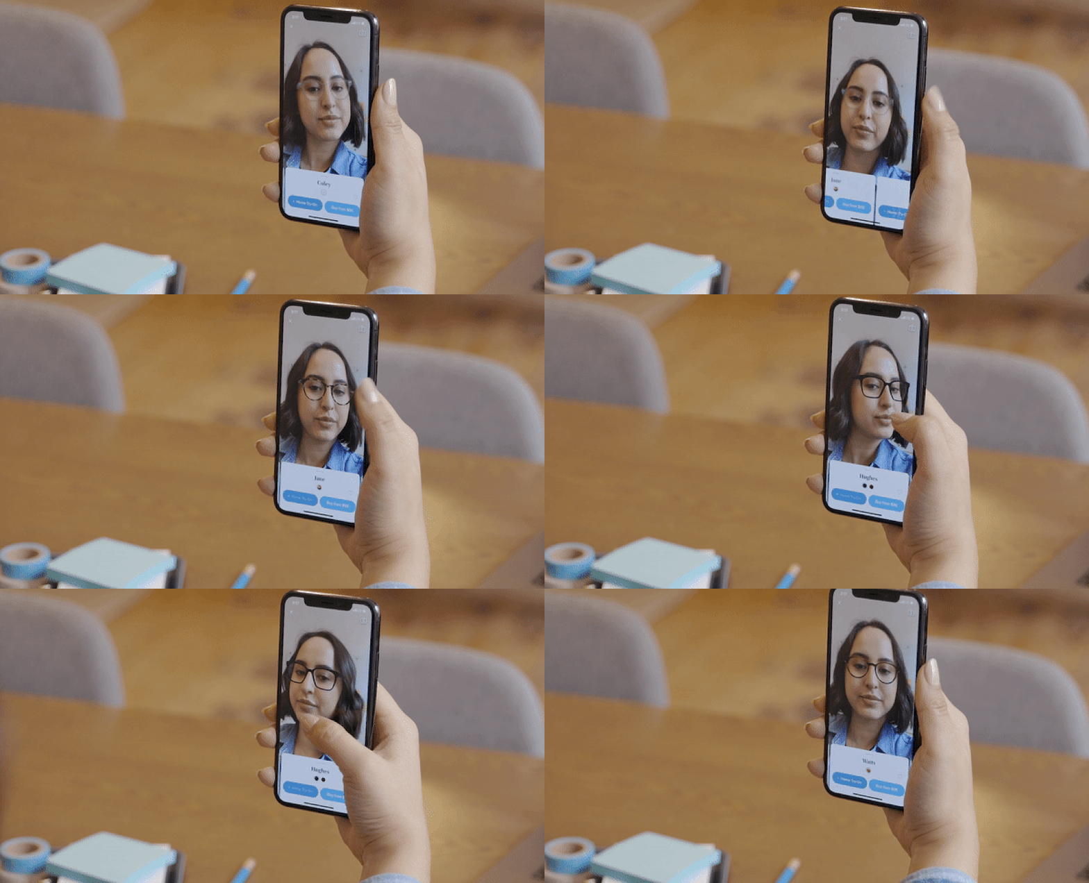
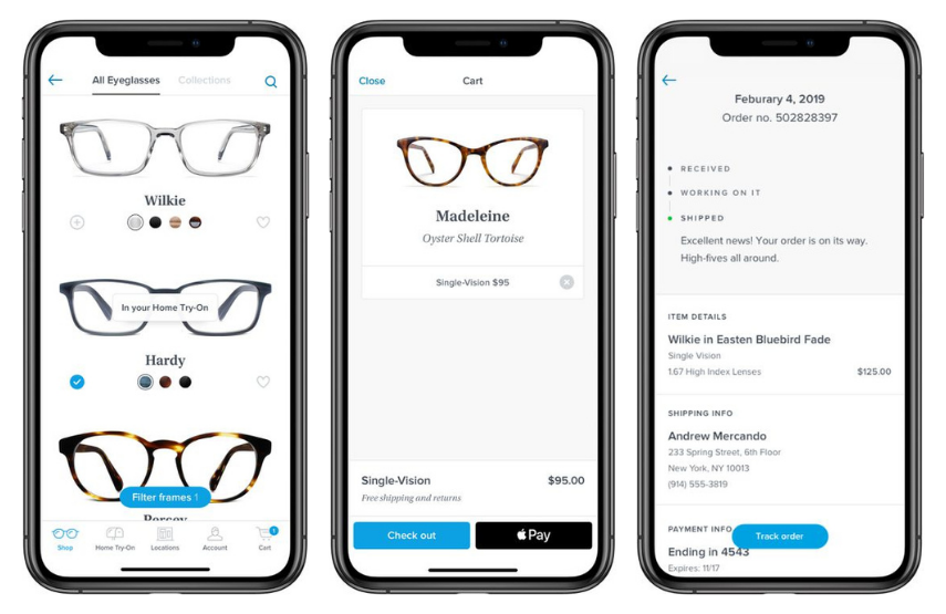
Consider Warby Parker, the online retailer of prescription glasses. They developed a mobile app featuring augmented reality technology that enables you to have a virtual try-on using your smartphone — all from the comfort of your home. You can even perform a prescription check and upload the results through the app for a doctor to review. These are the unique discovery and utility features only afforded by a native mobile app. The result? Over 55,000 five-star reviews and a rapidly growing base of loyal customers.
If you want to have this kind of effect on your customers, your mobile app must first establish all core commerce functionality before you can add the features needed to create a differentiated experience.
In this post, we break down the core components your mobile shopping app must include, as well as a simple yet effective strategy for successfully launching your app. But before we get into the details of building your app, it’s important to understand the benefits of mobile shopping apps and whether they are worth your investment.
[toc-embed headline=”Should You Build a Mobile Shopping App?”]
Should You Build a Mobile Shopping App?
Responsive web design and mobile-friendly frameworks have significantly improved the quality of mobile websites, but they are not the most effective way to turn mobile shoppers into loyal customers.
Mobile sites work well for shoppers at the beginning of their shopping experience. When they are still discovering products, accessing a mobile site via browser makes it easy for them to compare different options and switch between sellers. They can add products to their cart and checkout just as they would on a computer. But mobile sites lack the functionality that creates seemingly magical experiences like Warby Parker’s mobile app does.
Shoppers and app users will not tolerate anything less than exceptional or seemingly magical. So, in addition to having a desire and business need to increase customer loyalty, you must also have the desire and resources to create a truly exceptional experience. In fact, our co-founder, Ryan Bartley, tells most brands and retailers NOT to invest in mobile apps utility until they identify an insight that will lead to creating a differentiated experience.
“One mobile app experience we designed at Staples was the ‘world’s best pickup experience,’” said Ryan. “Imagine needing an immediate order fulfilled, so you place it on the app and get a notification that it’s ready for pickup. As you drive to the store, the store associate is alerted of your geo-location and they prepare your order. When you arrive at the store, they are waiting curbside. They greet you by name and place your package in the trunk. This is all seamlessly orchestrated by paired mobile apps between customer and associate.”
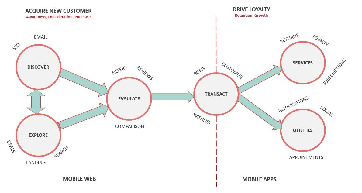
To better understand whether you should build a mobile app, it helps to know where your focus lies. Are you focused on growing brand awareness and acquiring new customers? If so, it’s probably too early to build a mobile shopping app. On the other hand, if growth through acquisition is steady and you want to focus on growth through loyalty, it’s time to start exploring the benefits of mobile shopping apps and how to build them.
[toc-embed headline=”Benefits of Mobile Shopping Apps”]
Benefits of Mobile Shopping Apps
In short, they are faster, more convenient, and easier to navigate. When someone downloads your mobile app, they are creating an intimate direct channel for you to communicate with them. This presents a massive opportunity to reach, influence, and convert shoppers better than ever before. If you are able to create an exceptional and seemingly magical experience for your customers, you can enjoy the following benefits.
Increased customer loyalty and retention
Loyalty programs have been an important part of retail for some time. Today, as customers expect more personalized experiences, loyalty programs have become even more significant for commerce.
Mobile apps provide the perfect medium for running a loyalty program for your customers. With a mobile app, you can give your customers a greater level of personalization by offering relevant suggestions and curated content based on their interests and previous purchases.
Customers have more control over their experience and can adjust their settings to suit their needs. They can easily manage their relationship with your brand and track their orders and rewards status all in a single place. Brands can deepen the connection even further by sending notifications with status updates or individualized promotions straight to the home screen of the user’s device.
Plus, customers stick with what they know. When they download apps, new ones are less likely to be installed. Retailers who are able to get their app onto a user’s device have the ability to acquire and retain loyal, long-term customers.
Better conversion rates and higher AOV
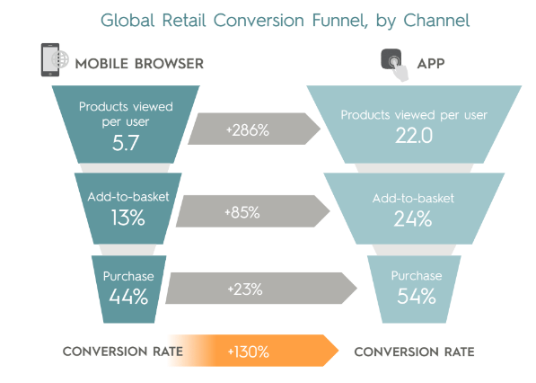
Conversion rates for mobile shopping apps are significantly higher than those on mobile sites. The highly personalized experience available through apps helps customers find the products they are interested in with greater ease.
With a mobile app, you are also able to integrate mobile wallets like Google Pay and Apple Pay to speed up the checkout process. Instead of having to pull out their card and manually enter their personal payment information, customers can simply select their preferred mobile wallet and checkout with the tap of a button.
It isn’t just conversions that are higher on mobile shopping apps. Average order value (AOV) is also higher as customers spend over 10% more per order when compared to mobile sites.
[toc-embed headline=”Mobile Shopping App Features”]
Mobile Shopping App Features
Before building your mobile app, it’s important to make a list of all the essential features the app will include. This will make the development process smoother and will help ensure your app performs well while still meeting user expectations.
The same commerce components you’ll find in a traditional e-commerce website will serve as the foundation of the mobile app. Where the app will differ is through the inclusion of more advanced features such as AR, a more intuitive loyalty dashboard, and a greater level of personalization.
Login
The login feature will allow customers to access their accounts to be able to view their order history, payment methods, personal information, and rewards status. After logging in for the first time, the app should store the user’s information for later sessions. Log in fields should include either a username or email as well as a password.
The app should also contain some form of biometrics to provide users the option for a more secure sign-in experience. This includes fingerprints, facial recognition, and voice matching capabilities.
Account Profile
The account profile page is where the user will be able to control their app settings and edit and save personal information which can be used to streamline the shopping experience. This includes:
- Payment methods
- Addresses
- Contact information
- Login details
The account profile should also give users a quick summary of their rewards status and the ability to add gift cards to their accounts.
Homepage
Screen space on mobile devices is limited. This means that brands and retailers need to have clean navigation to allow customers to move between pages without disturbing the user experience.
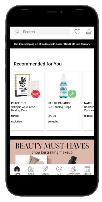
The home screen is where users will land upon opening the app. Along with the main content, it should provide users with a simple and unobtrusive navigation menu, a search function, and access to a shopping cart.
It can also be beneficial to personalize the page for each user. Personalization allows brands to create a unique mobile experience. This will include displaying products and promotions that are relevant to the user based on their interests and purchase history. Other personalization features include persistent login, the ability to choose the content, pre-populated local store, and more.
Search
The search function will provide users the ability to find anything that is accessible via the app. This not only means products but also content, help, FAQs, and account pages. The search bar should be type ahead, allowing users to get recommendations as they are entering their query.
When a user taps on the search bar, a simple drop-down menu should appear with their previous searches. It can also display trending searches or similar products viewed by the user. This will help improve user experience as shoppers will be able to complete search queries by tapping instead of typing.
The search bar can include a microphone icon that, when tapped, brings up the native Siri or Google Assistant microphone tool so the user can use voice to search.
The search function can also give users the ability to complete a visual search by taking or uploading an image. The app will then use machine learning-based image recognition to match any relevant products or information to the user’s photo.
Search results
The search results page should provide users with all the products related to their search terms. The layout should be similar to a category page with high-quality images of the product, the product’s price, and a short description. Consider using lazy loading for the page so that only the initial results are pre-loaded and the rest appear as the user scrolls down the page.
It is also important for the user to be able to filter the search results. Some examples of the criteria users could use to filter their search include:
- Price
- Color
- Size
- Category
The search results page should also enable users to sort the results using the following:
- Price: high to low
- Price: low to high
- Relevance
- Most recent
- Popularity
Browse and product taxonomy
The app should give users access to the higher level taxonomies so that they are able to navigate to their desired products without having to search for them. Also, the entry point to browse should be available on the app’s main navigation menu. When a user taps the menu, they should see a basic taxonomy of the main product categories that allow them to go directly to a particular category page.
Product detail pages
The product detail page should provide all essential information about the product. This includes:
- Product name
- Product price
- Variable attributes (size, color)
- Promotion information
- Related products
- Reviews
Along with the product information, the product page should include all the images for the product. Users should be able to scroll through the images and tap the current image to enlarge it so they can view it in more detail. This lets customers can surface information about a store’s selection ahead of time or use the app to learn more about an item they find in store.
If the product has variable attributes such as size or color, the product page should display the available options and allow users to switch between them. When a user selects a different variation, the main image on the page should change to match the item they have selected.
Accurate stock levels are necessary to ensure that a user does not purchase an item that is not available. When a user has selected a particular variation of a product an “in stock” status should be visible near the product title. If an item is not available an “out of stock” message should appear and the add to cart button should become non-functional while the unavailable item is selected.
The product detail page must also allow users to add items to their cart. When a user adds a product to their cart, a notification should appear notifying them of such and the add to cart button should change to a “go-to cart” button where the user can view all the items they have added to their cart before proceeding to the checkout page.
Cart
The cart page is where users will be able to see the items they have selected to purchase. On the page, the customer should be able to see each product name, featured image, price, and any variable attributes such as color or size. The total price for all the products should be displayed beneath the items.
Giving users the ability to edit the products in their cart can help improve the shopping experience even more. For example, after tapping a product, an option will appear for the user to change the quantity or any of the variable attributes for a particular product. The user should also be able to remove any products from their cart.
If you have a physical store, you can give customers the option to select buy online pickup in-store (BOPIS) before proceeding to the checkout page. Contactless checkout and alternative fulfillment methods like BOPIS help build consumer confidence in re-entering stores in a post-pandemic environment.
Checkout
The checkout page should give users the shortest possible path to completing their purchase. This means minimal taps and no distractions.
The secure checkout will require users’ personal information including:
- Full Name
- Address
- Phone number
- Email address
The app should automatically populate this information from the user’s account if it is available. Customers should then have the option to input their shipping information if it is different from their billing information.
Users will then have to provide payment details. They should have the option to quickly select a saved method of payment from their profile.
The checkout page needs to integrate with your payment processor to be able to accept payments. Offering multiple payment options such as Paypal and mobile wallets can help remove friction from the buying experience as customers can choose their preferred option.
After completing the checkout process, the user should receive a confirmation screen with the details of the order.
Customer loyalty dashboard
The customer loyalty dashboard is where users will be able to see their rewards profile. When a customer lands on the loyalty screen they should see their username, loyalty number, and any rewards/points they have. There should also be information about the loyalty program so a customer can learn how it works.
Order history
The order history page is where users will be able to see all their previous orders. It should be accessible from the main navigation menu. When a customer arrives on the page they will see a list of previous orders, each displaying the feature image of one of the products in the order, the order number, the date of the order, and the total price. Upon tapping on one of the orders, the user will be taken to that order’s detail page where they can see more information.
Order detail page
The order detail page will display a timeline of an order’s status, the order details, and the shipping information. Each product on the order detail page should link back to that particular product page. The order detail page will also give customers the ability to cancel an order or issue a return if the order has already been delivered.
Menu
The menu will help users navigate the different areas of the mobile app with ease. Here are some of the items to include in the menu:
- Browse
- Order History
- Account / Loyalty Dashboard
- Settings
- Wishlist
The menu should be accessible on every page of the app except for the checkout page.
Wishlist
The wishlist gives customers the ability to save products they wish to buy at a later date. Each category page and individual product page will have an icon that shoppers can use to add a specific item to the wish list. The wishlist page should display all the products a user has added along with that product’s images, title, and price. The bottom of the wishlist page should have the option to add all the products on the list to the shopping cart.
Deep linking
Deep linking ensures that users who engage with different touchpoints on their smartphones are directed to the mobile shopping app. For example, a user who taps a link for a product in a marketing email lands on that product detail page inside the app. Or, a customer who taps a push notification stating their order has shipped is taken to that order detail page.
Push notifications
The app should allow users to receive push notifications directly on the home screen of their smartphone. Some of the notifications that users can receive include basic transactional notifications like order confirmations and status updates. Push notifications are also a great way to engage with customers by sending them alerts for promotions and other events.
Native payment
Native payment support will allow users to pay for orders using popular mobile wallets like Apple Pay and Google Pay. This will speed up the checkout process as these wallets store a customer’s payment information, removing the need for them to type it in when they are completing their order.
Hook feature
Strong mobile apps have a hook feature that keeps users coming back for more. It’s an exciting feature, tailored to your unique offering and your customers. Recently, many companies have turned to augmented reality to differentiate their mobile app. This helps brands bring the store and products to the customer’s house, virtually.
[toc-embed headline=”Launching a Mobile Shopping App”]
Launching a Mobile Shopping App
Once you have laid out the essential features your app will include, the design and development process can begin. You’ll first have to decide which technologies to use to develop the app.
You could create a unique app for each operating system (iOS and Android) or you can go for cross-platform app development where you create a single app that works for multiple operating systems. Cross-platform development can lower your costs and time to market so you’ll want to keep this in mind if you have limited resources or need to launch quickly.
Whether you choose to develop the app on one or multiple platforms, here is a simple four-step process you can follow to maximize the success of your app launch:
Phase 1 – Shell app
The first phase of launching your mobile shopping app is to shell the application. This is where you will begin building the app and adding the essential components. During this phase, you will focus on the core commerce functionality that will enable users to follow a basic purchase path and complete their order.
The components that will be added during the phase include:
- Login
- Homepage
- Search
- Browse
- Product detail pages
- Cart
- Checkout
- Customer loyalty dashboard
- Wishlist
- Order history
- Order detail pages
- Deep linking
- Native payments
After these features are developed, you can begin testing the app to ensure it functions as intended.
Phase 2 – Controlled release
The next phase is a controlled release or “soft launch” of the application. This is where you will release the app to a limited number of users who can then provide valuable feedback that will allow you to refine the app for maximum success.
Before releasing the app to the initial set of users, you need to determine the following:
- How long the test launch period will last
- Who the target user is
- How many users are needed to gain the data necessary to refine the product
Once you have clarified the details of the controlled release, you can begin making the app available to your target users. The most valuable insights will come from those who are already interacting with your business. Take advantage of your email list and social media channels to reach out to previous customers and let them know you are creating an app and would value their input.
Along with collecting customer feedback, this phase will involve intensive UX and design testing.
Phase 3 – Refine user experience and design
The next phase in creating your mobile shopping app is to use the customer feedback and data from testing to refine the user experience and design elements by making any necessary changes.
Some important metrics to consider when evaluating your test launch include:
- User acquisition
- Sessions per user
- Time per session
- Retention rate
- Conversion rates
- Bounce rates
These metrics will give you an idea of how users are engaging with your app and will highlight any areas of underperformance.
Phase 4 – Launch and grow
Once the feedback has been used to fine-tune the app, you can begin the full launch. Here you will submit the app to the Google Play Store and Apple App Store to be widely available to the general public.
You will need to market the app to be able to maximize its reach and the amount of engagement it generates. Consider running paid advertisements like Google App Campaigns. This will help you get your app in front of potential customers through Google Search, Youtube, and directly in the Google Play Store.
Over time, as the app grows in popularity you can begin implementing even more robust features. This is where you will add components like individualized recommendations and curated content. You can also extend the push notifications beyond transactional messaging to include exclusive offers and promotions.
If you have a physical store you can implement a shopping assistant in the app. The assistant can help customers find items in the store and can make recommendations based on their interests.
Consistently measuring the app’s performance will ensure that you are providing your customers with a quality shopping experience. You’ll want to actively monitor the same metrics from the previous phase along with others including:
- App downloads
- Average revenue per user
- Loyalty interactions
- Mobile influenced sales
- Referral channels
[toc-embed headline=”Examples of the Top Mobile Shopping Apps”]
Examples of the Top Mobile Shopping Apps
Below are just a few of the companies providing truly great mobile experiences. If you would like to see more, check out:
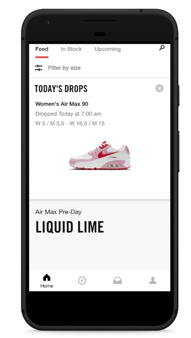
Nike
Nike has been a leader in the e-commerce mobile space for several years with four apps (Nike App, Nike Run Club, SNKRS, and Nike Training Club) popular among customers. They have prioritized the mobile experience after realizing shoppers are more engaged while interacting via the mobile app when compared to a traditional website. Customers who buy through the app also spend much more on average.
The home screen is highly personalized to each individual user. The goal is to create a one-of-a-kind experience, making each customer feel like they’re shopping in their own Nike store. Products are recommended based on the user’s interests and items pre-select the appropriate size based on the customer’s order history.
Customers can use the app to scan a product’s barcode to get more information on the item. This tells them if the product is in stock at the store, and what colors and sizes are available.
Using the app, customers can also request to try on a pair of shoes. The app shows the confirmation of the request and the sales team brings the shoes to the customer.
Lululemon
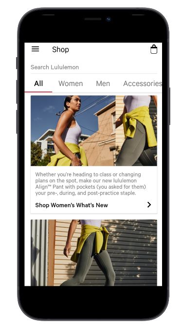
Lululemon uses its mobile app as a means to streamline the in-person shopping experience. You can shop your local store through the app to find a product’s availability right from your phone. This way, you’ll know if your preferred size and color are in stock before going to the store.
The app is clean and easy to navigate. The home screen displays a product catalog filled with featured collections. A simple menu featuring the product categories enables users to navigate to the products of their choice.
The three-bar ‘burger’ icon in the left corner of the screen opens up a navigation bar that customers can use to manage their profile, track their orders, or find a physical store.
While in-store, you can scan the tags for a product to quickly learn more about the item. Users can store their personal and billing information, helping to speed up the checkout process.
Sephora
Sephora is a great example of an app with a hook feature that helps provide a unique mobile experience. The Sephora Virtual Artist uses augmented reality technology to allow users to try makeup on virtually. The app scans the user’s face to detect their facial features to know where to place the product. Customers can then see how a particular product looks on them.
With the in-store companion, you can quickly check to see if an item is in stock. It also allows you to book a reservation for services and events.

EVP Revenue @ fabric. Previously @ Poq, ChannelAdvisor, and Xerox.
