Boost Conversions with a Superior E-Commerce Checkout Experience
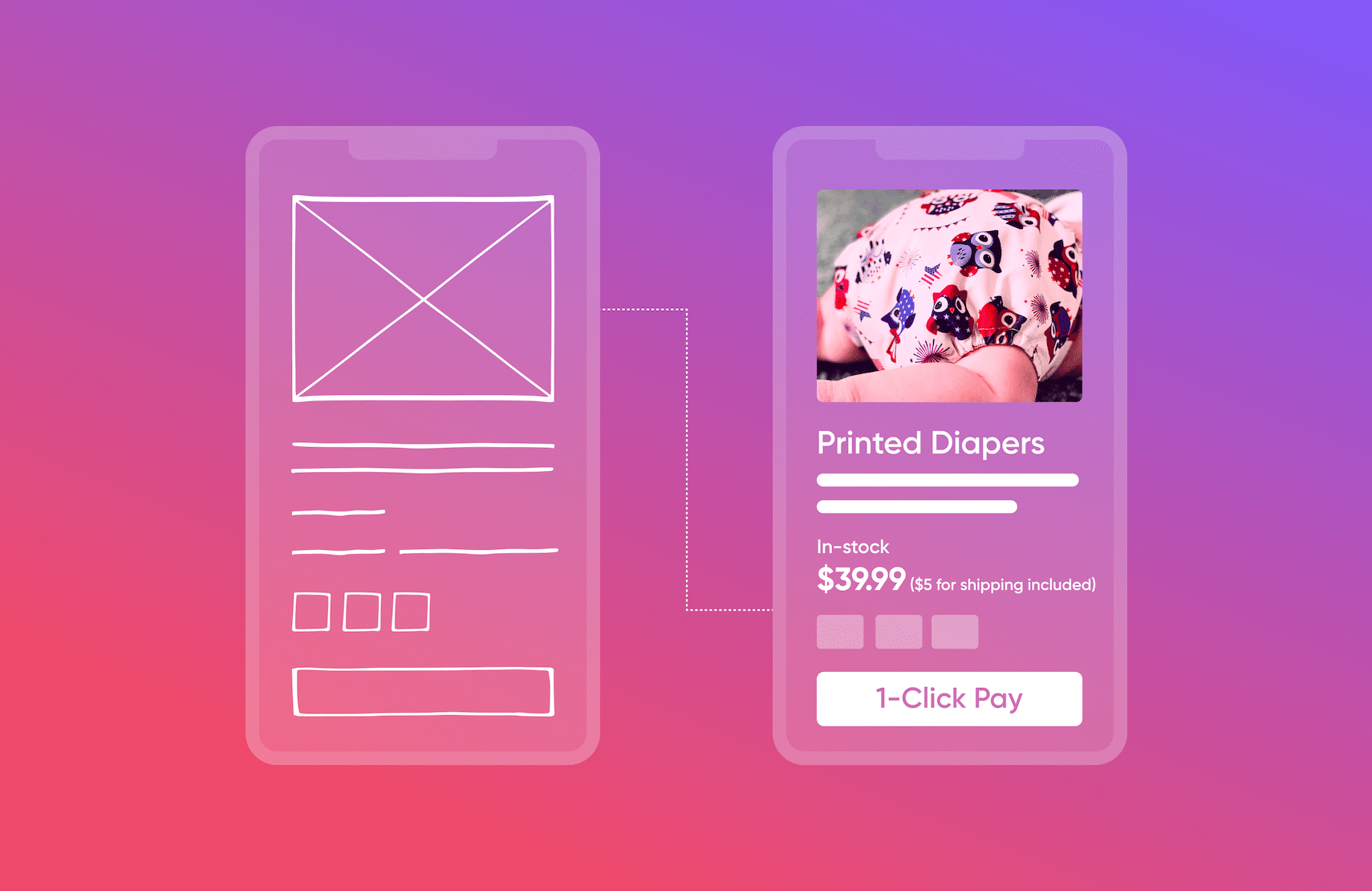
Research has shown that the average e-commerce cart abandonment rate is 69.82%, with high extra costs (shipping, taxes, fees) being the main cause of lost sales.
To address pain points, simple design changes and improved checkout flow can reduce friction in the checkout process and boost conversions.
More transparency into extra costs, real-time inventory updates, mobile optimization, one-click checkouts, more payment options, and adding wishlists are just some ways businesses can improve the checkout experience and boost conversions.
To create a better checkout experience, fabric’s OMS optimizes fulfillment processes and lowers shipping costs while fabric Pay provides multiple payment options for customers.
With software companies relentlessly innovating to improve the e-commerce checkout flow, there’s never been a better time for enterprise businesses to assess this fundamental process to ensure they’re providing the most seamless experience for their customers.
An excellent checkout flow is crucial for capturing e-commerce revenue. Customers want frictionless shopping and will not hesitate to leave your site mid-checkout. According to the Baymard Institute, an independent web UX research institute, the average cart abandonment rate is a staggering 69.82%. Their research was based on 46 different studies containing statistics on e-commerce shopping cart abandonment. What were the most common reasons for shoppers to abandon their carts in 2022?
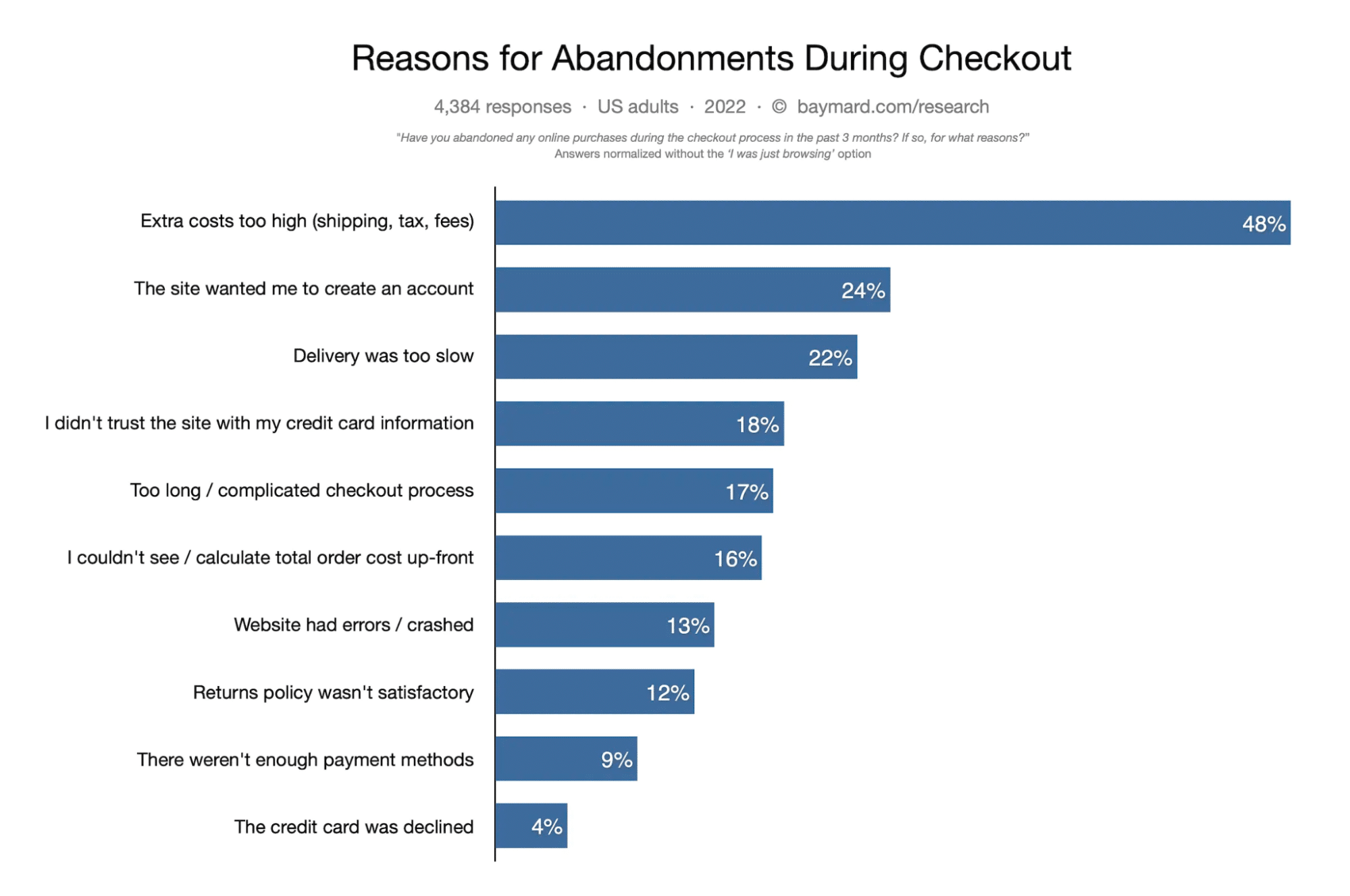
The survey found that shoppers often abandoned their carts if the extra costs (shipping, taxes, and fees) were too expensive, or if the process took too long or was overly complex.
The good news is, many of these issues can be resolved through simple design changes. Modern headless commerce solutions can help businesses create better checkout experiences and boost conversions by addressing many of these customer pain points.
For example, fabric’s order management system (OMS) can go a long way in optimizing fulfillment processes which will lower shipping costs for customers. Furthermore, a simple way to add multiple payment methods is to use a payment solution like fabric Pay. The platform integrates with popular options like Affirm, PayPal, Avalara, and Authorize.net and provides multiple payment options including major credit and debit cards.
[toc-embed headline=”E-Commerce 101: Tips for Creating a Great Checkout Experience”]
E-Commerce 101: Tips for Creating a Great Checkout Experience
There are several easy ways for businesses to reduce friction through the e-commerce checkout process. Creating a simple 1-page checkout, clearly displaying shipping costs and taxes, and offering a guest checkout option are just a few ways to address some of the top reasons for cart abandonment.
In addition, improving the time to interact (TTI) and the site speed, simplifying the process of adding coupons and gift cards, and offering more payment and delivery/pickup options are great ways to improve the experience for shoppers as well. Below are some strategies that businesses can use to further reduce cart abandonment and create seamless checkout experiences for their customers.
Provide transparent shipping options and costs
Transparency is key when trying to gain the trust of your customers. According to Sproutsocial, 86% of Americans say transparency from businesses is more important than ever before.
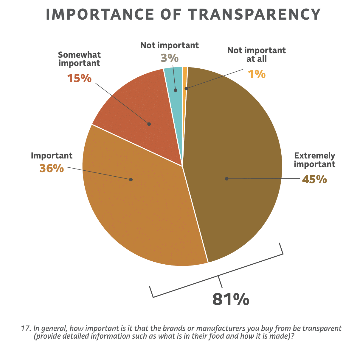
Meanwhile, a survey conducted by FMI and Label Insight found that shoppers considered transparency among brands and manufacturers to be an important factor in their buying decisions. More than eight in ten (81%) shoppers said transparency was important or extremely important while a minuscule 4% said transparency was not important.
Yet high extra costs for things like shipping, taxes, and fees remain by far the top reason for cart abandonment among customers. Users get turned off when there’s a lack of transparency and they’re hit with “hidden” charges that don’t appear until the final stage of the e-commerce checkout UX. This practice has become more common in recent years with merchants that try to trick the Google index with artificially low prices to win the search rankings, only to charge customers higher shipping costs at checkout.
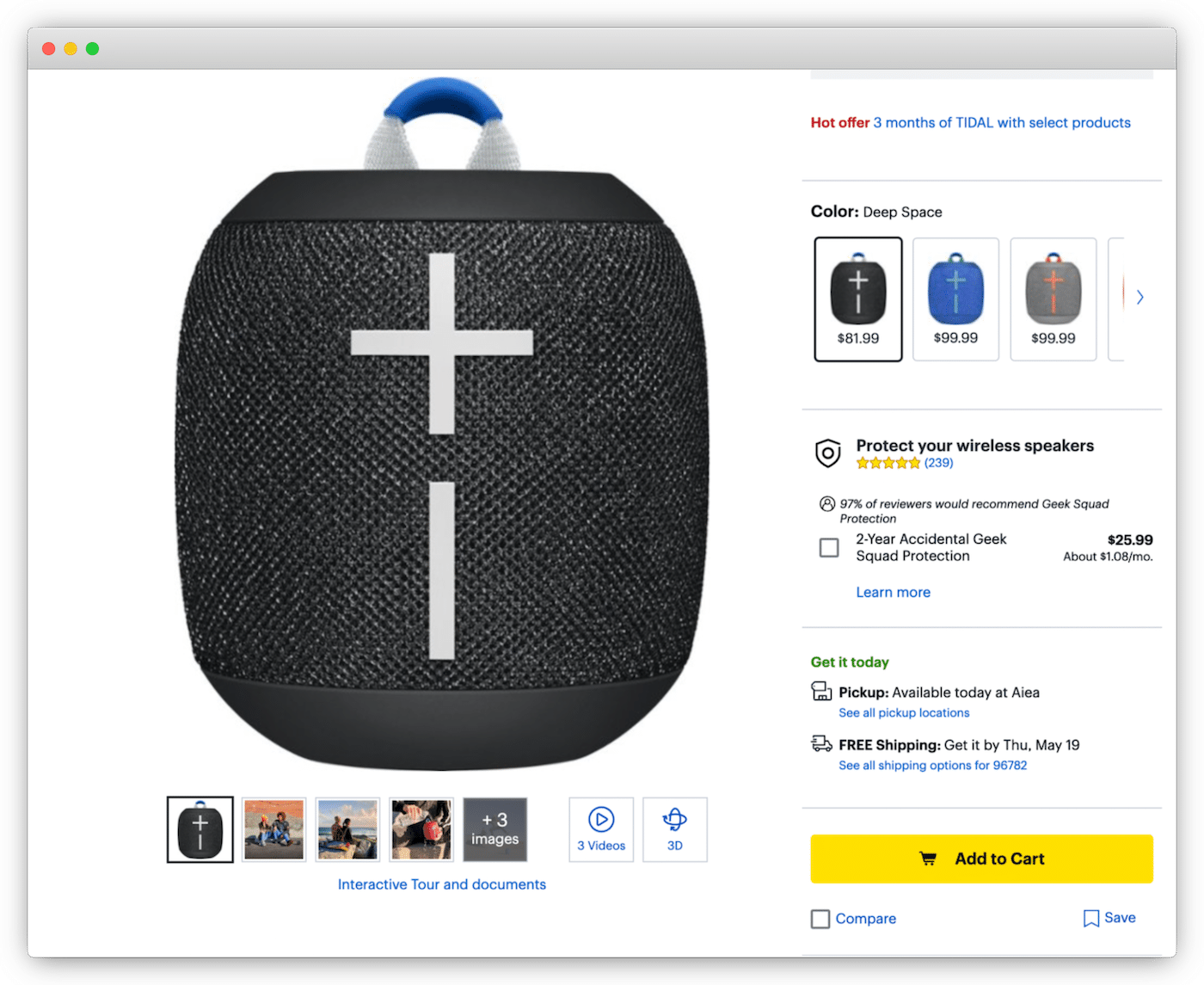
However, large marketplaces like Amazon, Best Buy, and Walmart lead by example by being very clear on what the extra fees are upfront. Additionally, a variety of shipping options (including free shipping) and delivery times (including same-day delivery) with different prices are well-displayed not only in the product detail pages (PDPs) but also on checkout pages as well.
Display real-time inventory
With 13% of customers abandoning their carts because of website errors and performance, maintaining a well-functioning online store is critical for e-commerce sales. Yet one of the most common issues that customers face is that they’ll purchase a product, only to find out later that the product has been sold out. Businesses will then provide a generic apology and a refund, but these measures do little to overcome the poor experience the customer went through.
It may seem obvious, but to prevent inventory shortages from happening, online shops should always only show items on PDPs that are available in inventory. This is accomplished by using inventory availability software powered by a real-time inventory update feed, which can seamlessly and automatically hide products and PDPs which are not available in stock. An inventory counter will suppress the page so the customer will no longer be able to search, browse, or access the page—which prevents products that are out of stock from being sold.
Offer pre-order and backorder options
Giving customers the option to pre-order products before they are launched is a great way to build hype and anticipation for product releases. It is also a great way to gather data for demand forecasting so that inventory levels can be adjusted accordingly.
Backorders are for customers that want to secure products that are temporarily out of stock. It allows businesses to continue offering out-of-stock products to customers with a promise to ship the desired products as soon as the inventory is replenished.
However, businesses need to be mindful of potentially making promises they may not be able to deliver on. A classic example are the merchants who pre-sold units of the Sony Playstation 5 ahead of its official release. Faced with an infinite stream of orders and with no means of obtaining inventory to fulfill them, merchants needed to constantly change the backorder date because the manufacturer couldn’t keep up with the demand.
For these reasons, inventory checks with proper pre-order and backorder functionality are critical for the customer checkout experience in 2022.
Optimize for mobile
Recent research by Fundera echoed the results of the Baymard Institute when they reported an average documented e-commerce cart abandonment rate of 69.57%. However, the average cart abandonment rate for mobile is 85.6%, which means there is a lot of room for improvement for the mobile checkout experience.
Increasing speed and responsiveness, optimizing product pages with clear calls to action (CTA), creating user-friendly navigation, and optimizing images and videos are e-commerce checkout best practices that enterprise businesses should employ to improve the mobile checkout experience for customers. With the number of mobile users projected to reach 7.69 billion by 2027, this is an important market for e-commerce that companies can’t afford to ignore.
Address verification service
Shipping and billing fields are a strong point of friction in the checkout process. Customers can get frustrated when they have to type out their addresses, especially on mobile devices.
Additionally, errors are common as people make typos or use incorrect formats. These errors can result in delivery failures. While you may not be directly responsible for issues like these, customers will blame you nonetheless.
Companies can solve this problem by using an address verification service (AVS). AVS auto-detects address attributes as the user types. It then populates address suggestions based on the user’s input, IP location, and other data.
In most cases, the user sees the correct address in a dropdown menu after only a few keystrokes. They can then click the address to complete the form without having to type every detail. Research from Baymard Institute shows that AVS reduces the amount of typing by 40% for most addresses. Equally as important, it eliminates errors.
Payment options and mobile wallets
Merchants today need to offer multiple payment options to reduce the chance of cart abandonment during checkout. However, the journey of a guest checkout is very different from a logged-in checkout, so businesses need to offer options based on which journey the customer takes.
For instance, a guest checkout may only require very basic details, like a physical address for shipping and an email address for communications. Furthermore, if the purchase is made through mobile, trusted and secure payment mechanisms should be supported out of the box and should automatically load up as well.
Mobile wallets are a huge driver for conversions during the checkout process because they can overcome the hesitancy that shoppers feel when websites request additional information. A few of the trusted wallets on mobile include Apple Pay, Google Pay, PayPal, and Venmo.
But whether it’s with a credit card, mobile wallet, gift card, or other payment method, customers like to use their preferred payment method whenever they can. When their preference is unavailable, they may stop the purchase. Brands can improve their checkout experience simply by offering multiple payment options. fabric Pay is a high-performance payments solution that provides multiple payment options including major credit and debit cards and digital wallets like Apple Pay and Google Pay.
One-click checkouts
Unlike guest shoppers, logged-in users go through a different checkout journey. Therefore, giving customers the ability to do one-click checkout is a great way to reduce friction and increase conversions.
A classic example is Amazon’s one-click purchase feature which gave birth to the Buy Now button. Most people are aware that if you’re logged in to Amazon’s site, the buy now button is a quick and seamless way to make purchases on their platform. Because all of your information is stored in the user profile—including payment and delivery info—Amazon will simply push the order through with one click.
However, there’s a lot that happens on the back end that a lot of people don’t see. For example, with multiple sellers of certain products, Amazon will automatically sort through the available merchants and route the sale to the best-seller—whether that’s a third-party seller or Amazon itself. Generally, this means sellers that have the best rating (the highest feedback score of 98% or more), the best shipping method with a track record of on-time shipments, and the best price will get the primary sale.
If the customer decides to sift through the different sellers, the best merchants will also have a buy now button appear beside their listing versus the unreliable sellers that don’t. Even for non-primary sellers, this one-click option for customers has become a driver for conversions too.
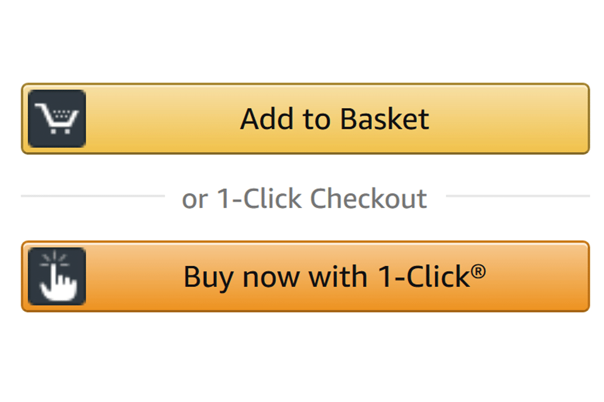
Yet another great example of Amazon reducing friction for checkout is the buy it again button. Logged-in users can browse their purchase history with the option to buy items again with the click of a button. Amazon’s seemingly simple e-commerce checkout flow is an obvious solution for frictionless transactions. Yet to this day, very few companies have followed Amazon’s lead and given customers the option.
Carts and wishlists: Providing the option to buy later
Perhaps one of the most overlooked strategies that e-commerce companies could use to improve the checkout process is to give shoppers the option to buy their products later. Whether items are added to a cart that can be seamlessly accessed at a later time, or into a wishlist that can be shared with friends and family, giving customers this option creates a level of stickiness that does wonders for conversions.
A birthday party, bridal shower, or a baby shower are all occasions where a wishlist would be very helpful. Individuals can just pick and buy items from a chosen list of products rather than risk buying something on their own that may or may not be what the guest of honor wanted.
[toc-embed headline=”Create a Smooth E-Commerce Checkout with Headless APIs”]
Create a Smooth E-Commerce Checkout with Headless APIs
The characteristic of traditional platforms is that they come with a predefined experience. This allows you to get up and running but leaves little to no ability to customize the checkout process.
Building an architecture on headless APIs frees you from a predefined experience, as it allows for unlimited customization when creating your checkout flow. Headless also provides the ability to create a checkout experience unique to each frontend. This is vital for adding checkout functionality to new channels such as voice, video, and augmented reality.

Product @ fabric. Previously @ EMAAR NEXT, Groupon, and NorAm International Partners.
