Making E-Commerce More Accessible: 6 Tips for Developers

Ignoring accessibility is a way to drive customers away from your e-commerce site. While it’s easy for developers to focus on new features and bug fixing, putting effort into inclusive, accessible sites will have huge benefits.
Accessibility impairment is more common than you might think. According to Shopify data, 2.3 percent of people live with a reading disorder, 8 percent of men have a form of color blindness, and 7 percent of people live with a severe dexterity disability.
In this article, I’ll highlight six areas where developers can make e-commerce sites more accessible. But first, let’s look at the current accessibility standards and tools that streamline web browsing for e-commerce sites and other site types.
[toc-embed headline=”Web Accessibility Standards and Tools”]
Web Accessibility Standards and Tools
Accessibility standards exist to outline what to work toward clearly. The Web Content Accessibility Guidelines is a great resource for web content accessibility. It provides a single, shared global standard to meet the needs of individuals, organizations, and governments.
In some cases, accessibility standards are legally required. Applicable rules depend on your location, the products you sell, and the size of your business.
How to implement accessibility
If you’re just beginning to implement accessibility, a11y-101 is a great starting point. After implementation, ensure the product works well on screen readers and can be used via keyboard navigation. User testing, although pricier, is also an effective option.
Automatic audit tools, like the a11y command-line tool, identify issues quickly and easily. The HTML_CodeSniffer is useful when testing for specific compliance guidelines.

See the result of using the a11y command-line tool on fabric’s site. Installing took thirty seconds, and running the tool is even quicker. Tools like this can significantly improve your accessibility without sacrificing time.
[toc-embed headline=”Tips for Improving E-Commerce Accessibility”]
Tips for Improving E-Commerce Accessibility
Let’s take a look at the six specific tips for addressing problem areas to improve the accessibility of your e-commerce channels.
Improve product carousels
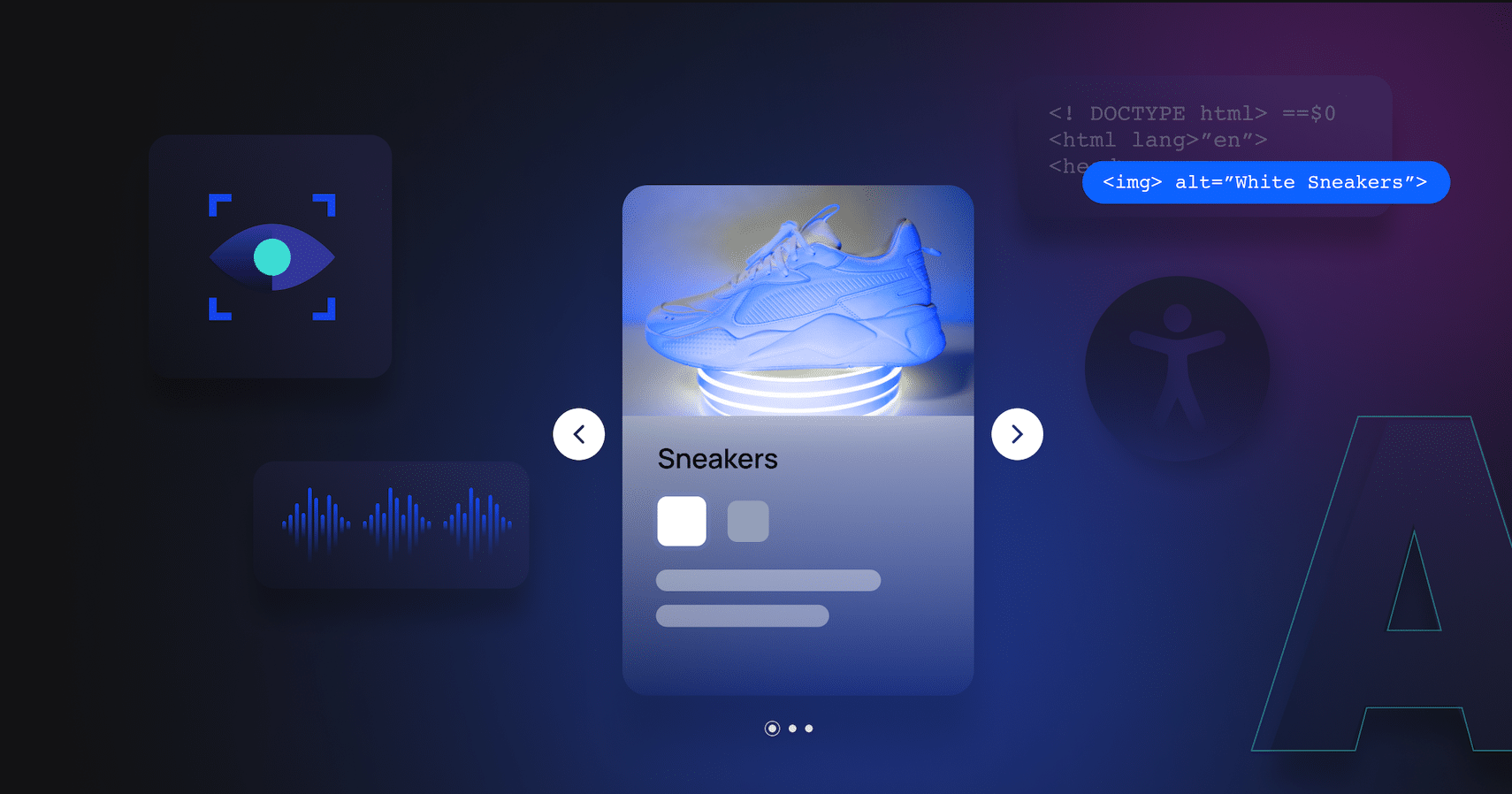
A carousel is a visually appealing way to show off products. This love, however, is not universal. They have several accessibility problems. First, their controls are unclear, particularly for the visually or cognitively impaired. Second, a screen reader may not associate controls with the required action. A control system that is obvious to a designer may not be intuitive to users.
Carousels that autoplay are an issue for those who use a keyboard to select screen elements. Users may not reach the control they want in time. Those who need more time to read are also frustrated when content changes automatically. Furthermore, the element chosen may also revert to the first available one when the carousel updates, making the whole site difficult to use.
If your client insists on using a carousel, you can still take steps to improve its accessibility. For example, see this sample code from the W3C Web Accessibility Initiative (WAI) under this license. It features readable text, optimizes for keyboard focus, and communicates changes to all users.
Although carousels are not ideal, you can still improve your site’s accessibility with them. In the below snippet, a live region is being created and then used later in the code. Doing so announces to users with visual impairments changes to the highlighted item.
    // In the init function, we add a live region to announce the slide number when using the previous/next buttons

function init(set) {

    //…… other code here

    var liveregion = document.createElement('div');
    liveregion.setAttribute('aria-live', 'polite');
    liveregion.setAttribute('aria-atomic', 'true');
    liveregion.setAttribute('class', 'liveregion visuallyhidden');
    carousel.appendChild(liveregion);

    //…… further code
}

// later in the setSlides function, we decide what happens when the slide is updated

function setSlides( args ) {

    //…… other code here

    if (announceItem) {
      carousel.querySelector('.liveregion').textContent = 'Item ' + (new_current + 1) + ' of ' + slides.length;
    }

    //…… further code

}
Make visual elements accessible
Using only visual elements to present your product information excludes potential customers who cannot see them. Making information available to everyone is critical for accessibility. For images, that means including an alt tag, as seen in the following code:
img src="coffee-maker.png" alt="blue coffee maker with glass
mug and simple control panel" width="300" height="200"
Video presents challenges to many users. But, with the right tweaks, you can make them available to everyone. Here are some changes to consider:
- Captions: Captions make videos easier to follow, especially for the hard of hearing. Open captions are included in the actual video, while closed captions use a separate text file for screen readers and the visually impaired.
- Transcripts: Providing a video’s full text as a separate transcript is an excellent way to increase accessibility. Transcripts also benefit those who prefer skimming through text, as opposed to a strictly visual format. Some media players, such as Able Player, automatically generate transcripts from closed captions.
- Audio descriptions: Spoken audio describing a video helps visually impaired users understand what is happening. This can be presented as a separate, optional file or played alongside the video.
- Accessible video players: If your frontend channels utilize a video player, make these more accessible too. Look to include supporting captions and audio descriptions, allow videos to be paused, have clear controls, and use high-contrast colors.
Replace or improve captchas
Captchas are designed to prevent bots and AI from accessing websites. However, AI is pretty good at them, scoring 98.4 percent on distorted text problems. In response, captchas are becoming harder, but this added complexity is causing difficulties for those with impairments.
Captchas are the biggest problem cited by screen reader users. Many visually impaired people cannot solve a visual captcha, leaving them unable to access the protected content. Although an audio captcha is a good alternative, they can also have accessibility problems. Furthermore, not all systems have audio available.
There are alternative ways to identify bots beyond captchas, so you can avoid using them altogether. One solution is to time how long a form on your e-commerce site takes to complete. Spambots can fill and submit forms instantly. By excluding any messages completed in under ten milliseconds, you can filter most of these bots out.
Another solution is to use server-side AI to analyze messages and filter IP addresses. For example, the honeypot involves hiding a form field so users cannot see it, but spambots still attempt to fill it in. It lets you identify spambots and filter out their responses accordingly.
See how to make a form field hidden:
input name="name_bot_trap" type="hidden" value=""Note: Not all spambots will fall for this. Check out other techniques here and here.
Use high-contrast themes
For users with visual impairments, some visual elements don’t stand out, affecting the UI. One way to improve accessibility for color-blind users is to use contrasting colors. For instance, selecting colors on opposite sides of the color wheel contrasts nicely for everyone.
Some users also find excess brightness difficult to look at and prefer darker themes. Thus, some sites allow users to enable Dark Mode. You can offer this with CSS and JavaScript. Browser extensions, like Dark Reader, offer solutions. This extended tutorial explains writing a theme switcher in React.

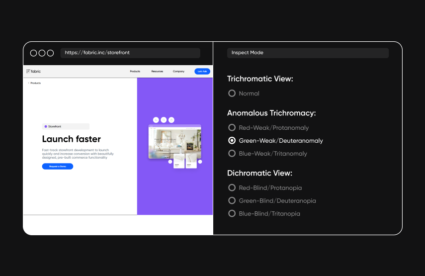
There are several types of color blindness, and a color scheme that works for one user may not work for another. Thus, you can also conduct testing with color-blind users. Alternatively, you can take a screenshot of your site and test it in a color blindness simulator to see how your site looks and identify any issues to fix.
Provide input assistance
Form inputs need to be clear and understandable. They should alert users to any errors but also offer solutions. For example, making a field “required” is impairs accessibility. Using an asterisk to indicate a required field confuses screen reader users, who just read out “asterisk.” If you mark a field as required in HTML, screen readers will pick up on it but still read out the asterisk.
Adding the text “required” is a good compromise. You can use the aria-hidden tag to mask the asterisk. This displays the asterisk while making sure readers ignore it:
label for="input_four">First Name *required label
input id="input_four" type="text"
The visible-hidden is a CSS class to hide the “required” text from visual rendering. See a11y-101’s approach to hiding text:
.visible-hidden {
	clip: rect(1px, 1px, 1px, 1px);
	height: 1px;
	overflow: hidden;
	position: absolute;
	white-space: nowrap;
	width: 1px;
}

.visible-hidden:focus {
	clip: auto;
	height: auto;
	overflow: auto;
	position: absolute;
	width: auto;
}
Although that’s a good start, older readers may not support the <aria-hidden> tag.
Another aspect to consider is where to place an indication of “errors” on forms. Readers should be able to find it. For example, a small line of text at the top or bottom of your form can easily be cut off from the user’s screen. Providing text that explains how to fix specific errors automatically read by screen readers is ideal. Like carousels, you should aim to prevent screen updates resetting keyboard navigation.
Keep customers on-site
Affiliate links can confuse users by taking them away from your site to a different one. For instance, driving users to a commercially driven, flashy site can be stressful. To improve accessibility, ensure it’s clear where links lead.
Those using screen readers navigate using the tab key to move around the page. They must tab through affiliate links, making this process slow. Allowing users to skip links helps speed up the process.
fabric’s Experience Manager lets you build a headless CMS that keeps data and backend services separate from the presentation layer. This allows you to deliver a consistent, accessible experience across multiple channels, ensuring users don’t get confused as they move between channels.
[toc-embed headline=”Key Takeaways”]
Key Takeaways
- In an increasingly diverse, complex e-commerce landscape, it’s more important than ever to consider the differing needs of your users.
- This is particularly true for the millions of users who have difficulties with site usability. Therefore, improving your site’s accessibility is essential.
- fabric can help build an e-commerce site to meet user accessibility needs and deliver a great experience for everyone.

Content marketer @ fabric. Previously marketing @ KHON-TV and Paramount Pictures.