Breaking Down Lowes’ E-Commerce Site [Video]

In this episode of Coffee + Commerce, we break down Lowe’s e-commerce site with Faisal Masud. Faisal is our CEO here at Fabric and was previously the director of AmazonBasics and the CTO at Staples.
Lowes is an American retail company specializing in home improvement that reported an online sales spike of 135% year-over-year in August 2020. This growth in sales followed the company’s shift away from a “decade-old e-commerce platform” according to the CEO of Lowes.
As you’ll see in this episode, Lowe’s has product detail pages (PDPs), category pages, and a checkout flow that follow e-commerce best practices. However, their online services experience is not intuitive and their inspirational content does not include basic commerce functionality (i.e. add items to complete this project to your cart).
By directing the points highlighted in this episode, Lowe’s and other home improvement companies can grow e-commerce even more than they did in 2020.
[toc-embed headline=”Key Takeaways”]
Key Takeaways
[0:21] Avoid generic search recommendations.
In the search bar, Lowes recommends some “Trending Now” items but these items seem to be fixed and manually added by the company’s e-commerce team. This fixed recommendation functionality is common among sites that don’t use “smart search” offered by third-party SaaS providers like Algolia.
[0:32] Have detailed yet intuitive product navigation.
Despite the company’s large collection of SKUs, it’s easy for online shoppers to find the products they’re looking for. Proper product attribution and detailed product characteristics help shoppers find the product and quickly make buying decisions.
[1:15] Optimize your cart for cross-sells and delivery dates.
The cart that appears on the right side of the browser contains strong cross-sells for related products, services, and warranties. Also, estimated delivery dates and price totals are clearly shown here.
[1:55] Disable navigation on checkout pages.
To encourage checkout completion, disable links on your checkout page that take shoppers back to the store. Make it so the shopper must click the back button in their browser to return to the store.
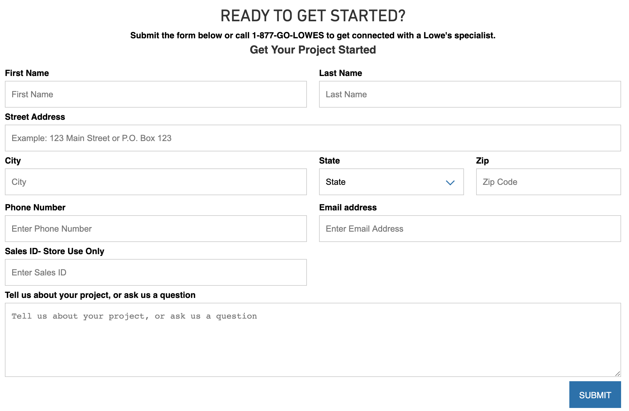
[2:58] Simplify installation service requests.
Shoppers who want installation services from Lowes must complete an exhaustive form (below). There is even a field for a Sales ID, something the average shopper knows nothing about. There are opportunities for making this form more intelligent.

[4:18] Add commerce functionality to inspirational content.
In the Ideas section of the site there are home improvement tips and how-to articles for projects. However, there’s no ability to add items needed to complete projects to your cart. This is also the case for sites like Kroger.
To make changes based on these recommendations and upgrade your e-commerce site, a headless commerce setup is vital. This makes it easy to add new e-commerce functionality and features while maintaining full control over site experience. To learn more about this modern approach to e-commerce, check out Fabric.

Content marketer @ fabric. Previously marketing @ KHON-TV and Paramount Pictures.