Which PDP Images Improve E-Commerce Experiences?

There are many factors to consider when trying to build a perfect product detail page (PDP). But few e-commerce managers realize that making changes to PDP images is one of the most effective ways to improve the overall e-commerce experience.
Consider these statistics on consumer psychology: Ninety-three percent of consumers consider visual appearance to be the deciding factor in a purchase decision. An Etsy buyer survey also found that 90% of shoppers think the quality of the photos is “extremely important” or “very important” to a purchase decision.
[toc-embed headline=”Optimizing Your PDP Images”]
Optimizing Your PDP Images
The best PDPs generally contain comprehensive and critical information that customers need to make fast, informed buying decisions. However, optimizing your product images can also enhance the shopping experience for your customers.
Use more, larger images
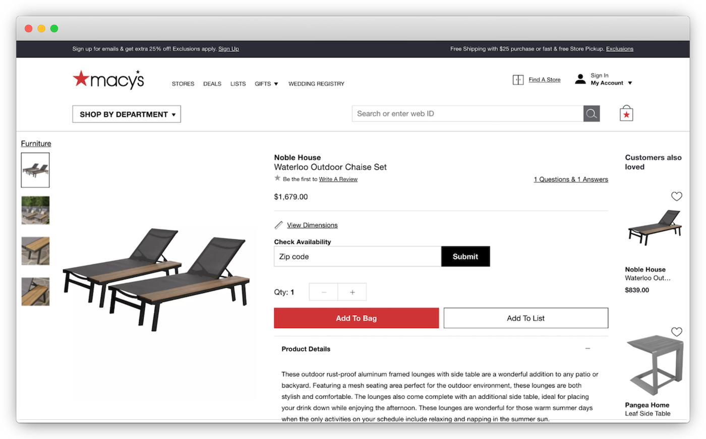
Below is a PDP for an outdoor chaise set sold by Macy’s that could benefit from image optimization. Take note of how the image frame only takes up a small fraction of the page and how the image gallery only contains four photos. This does not feel like a 1,679-dollar experience.

In general, larger photos convert better than smaller photos, and most shoppers expect to see an average of six images when looking at products on e-commerce sites. Fewer pictures also mean the buyer can’t see the product from different angles or learn about its dimensions, functionality, materials, or other key features.
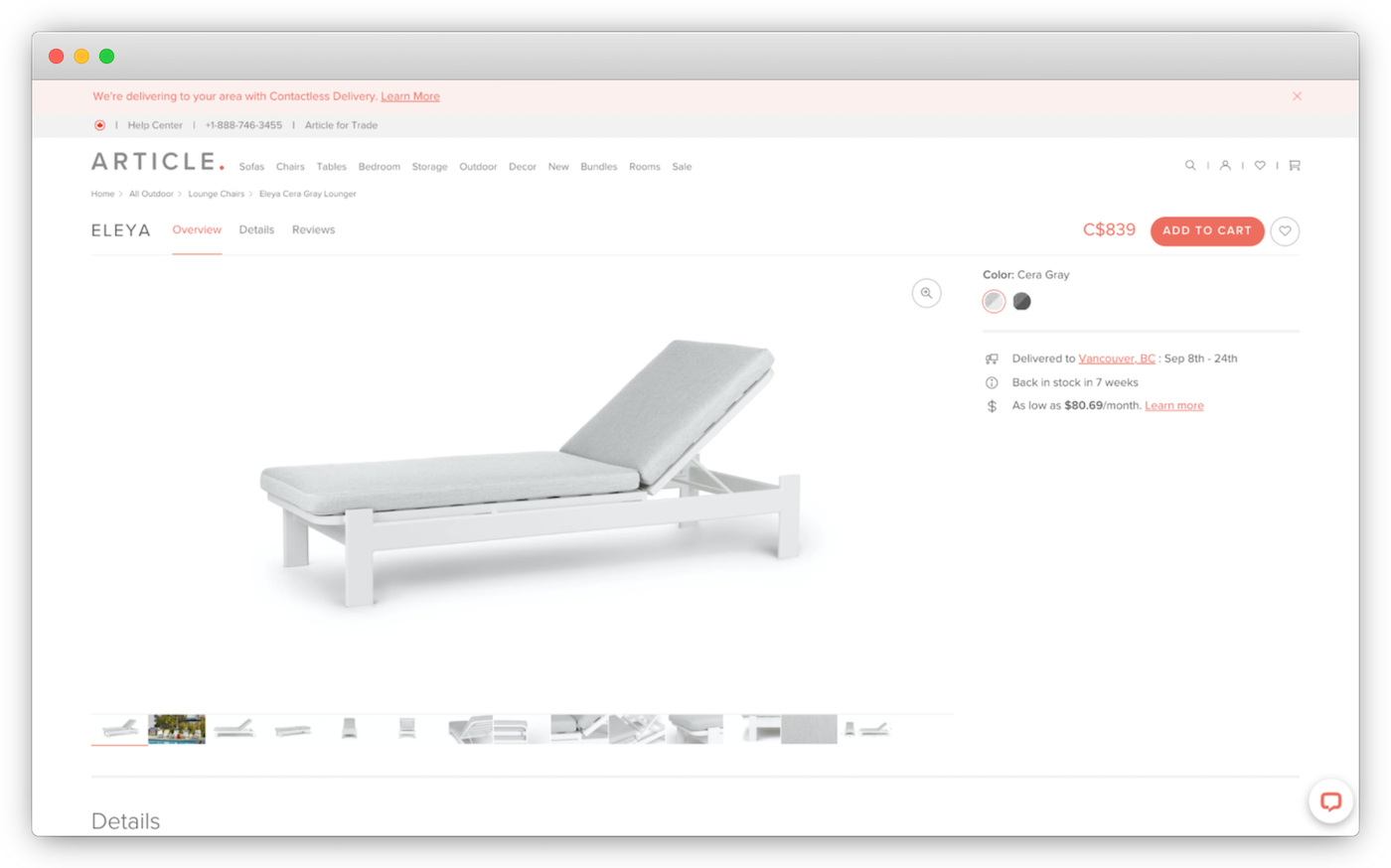
Now take a look at this outdoor lounge chair sold by the furniture company Article:

On this PDP, the image frame takes up a significant percentage of the page. The image gallery also contains numerous high-quality pictures for the buyer to click. The page displays the product from multiple angles, provides close-up shots of critical components, zooms in on the texture of the materials, and includes an image with the dimensions. These high-quality pictures go a long way in educating the buyer along their purchase path.
Use lifestyle images, avoid product dilution
Another way to optimize your images is to include lifestyle photos. These shots show what the product would look like in the real world and show other objects to give context or involve people using the product in real life. However, it’s important to keep the focus on the product or you can lose the buyer’s attention.
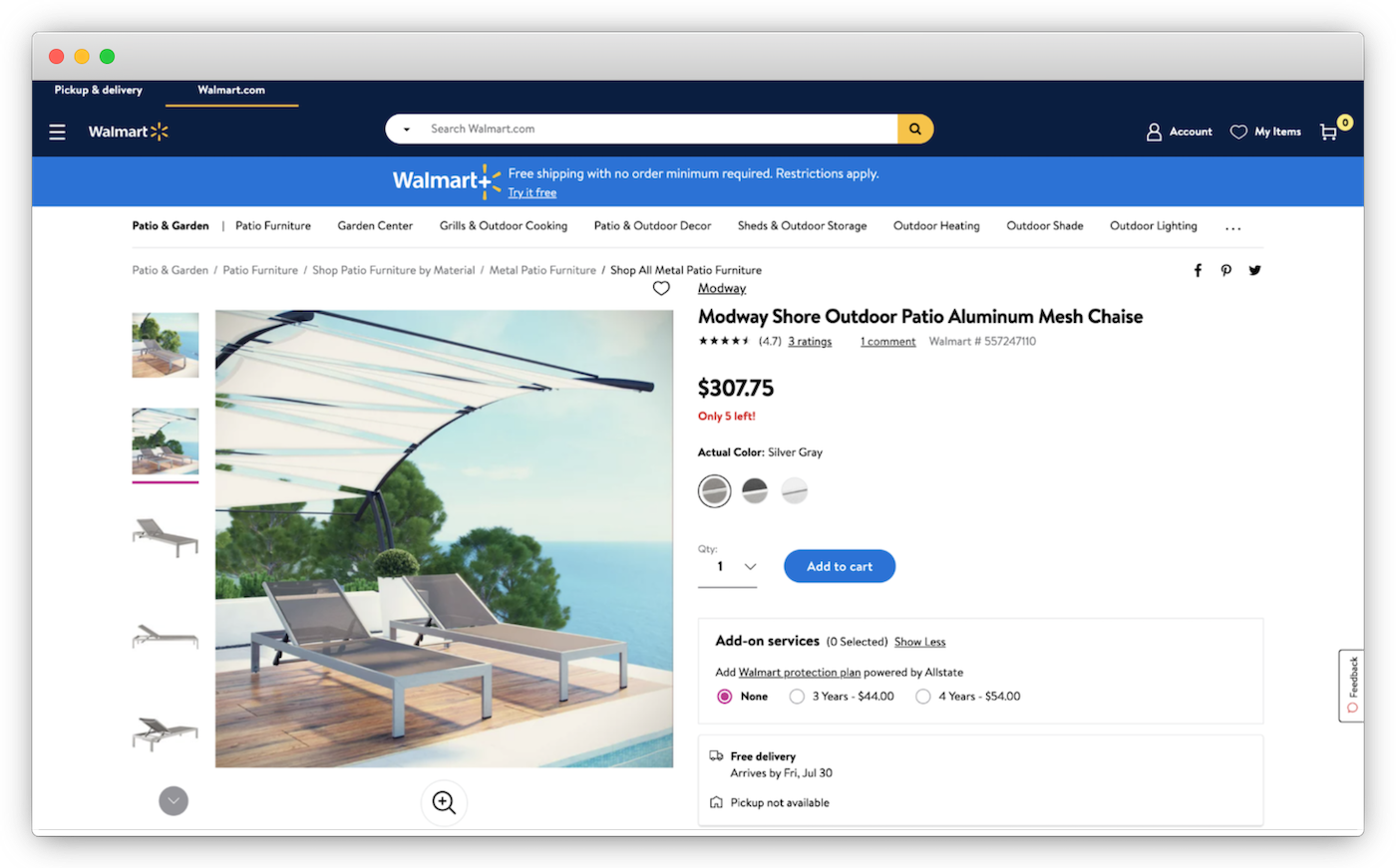
To illustrate this point, the PDP below contains a lifestyle shot for an outdoor lounge chair sold by Walmart:

Notice how the chairs are pushed to the bottom of the image while the large overhanging cover draws attention away from the actual product for sale. When choosing lifestyle images for PDPs, sellers need to be mindful of the size of the product relative to other objects in the picture, the percentage of the product within the image frame, and the positioning of the product in the photo as well.
[toc-embed headline=”Marketplace Guidelines for PDP Images”]
Marketplace Guidelines for PDP Images
According to Etsy, product images should grab the buyer’s attention, clearly display the product, communicate information about size, color, and materials, capture the purpose and feeling of the product, and help shoppers imagine the product in their lives.
In addition, many major online retailers and marketplaces provide specific guidelines on what images you can and can’t use for PDPs. These include technical requirements and site standards for product images. For reference, take a look at these examples:
[toc-embed headline=”Key Takeaways”]
Key Takeaways
- Making changes to PDP images is an effective way to improve the e-commerce experience.
- Optimize your photos for size, number, position, content, and quality, and be sure to keep the images focused on the product for sale.
- To further improve PDP images, follow marketplace guidelines for technical requirements and site standards.
- fabric PIM helps you manage your product data (including images) and ensure image consistency and quality across sales channels.

Strategic advisor and CTO @ Foundry. Previously director of consumer shopping experience @ Amazon.