E-Commerce Design Best Practices: Learnings from Auditing 20+ Websites
If the past two years are any indication, we are still in the early days of a disruptive megatrend that’s driving e-commerce penetration around the globe. With worldwide retail e-commerce sales expected to climb 16.8% and reach $4.9 trillion in 2021, the steady march towards the new digital economy will likely intensify in the years ahead.
That’s why now, more than ever, implementing e-commerce best practices is critical to success.
At fabric, we work closely with mid-level and enterprise companies to develop e-commerce strategies to help them meet the rapidly evolving expectations of consumers. This involves the implementation of e-commerce design best practices on their website to deliver shopping experiences that increase traffic, decrease cart abandonment, and increase average order size.
While design and UX are not the only categories of e-commerce best practices—technology, customer service, and merchandising matter, too—implementing e-commerce design best practices on your homepage, product detail pages, and other web pages is imperative for selling more.
In this article, I will share tips for improving e-commerce through design based on my audits of over 20 e-commerce websites for the FDS team. But, before we dive into my learnings, we need to review which e-commerce metrics to track so you can measure the effectiveness of the best practices you implement.
Website Metrics to Track
While there are many website analytics options to choose from for tracking e-commerce metrics, Google Analytics is a good place to start. However, as you grow, you’ll want to consider using more specialized e-commerce analytics tools. As for Google Analytics, here are some of the available e-commerce reports and metrics you can track:
- E-commerce Overview Report: Metrics include revenue, e-commerce conversion rate, transactions, average order value, average price, average quantity, and unique purchases.
- Shopping Behavior Analysis: Metrics include product page views, adding/removing products from carts, initiated transactions, abandoned transactions, and completed transactions.
- Checkout Behavior Analysis: Metrics include completion rates for billing and shipping, payments, reviews, and sessions with transactions. It also tracks abandonment rates for billing and shipping, payments, and reviews
- Product Performance: Metrics include individual product revenue, purchases, quantity, average price, and average quantity by SKU and category.
- Sales Performance: Metrics include individual transaction revenue, taxes, shipping, refund amount, and quantity.
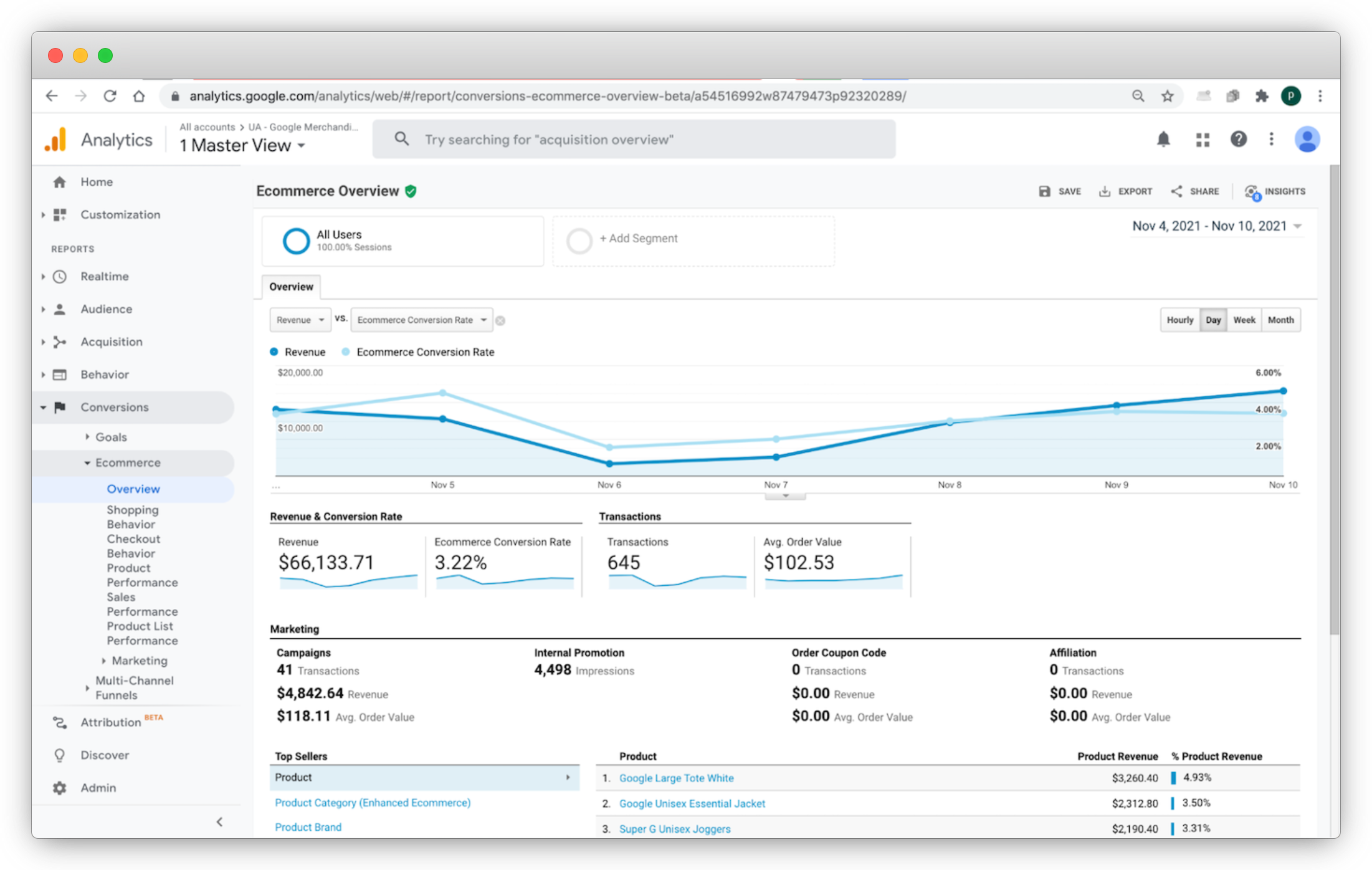
This data and other Google Analytics data can help you understand the bottom line return of e-commerce best practices you implement. It can also help you understand which products sell well, which products are best suited for your customer base, and which are supported by your best marketing efforts.
[toc-embed headline=”E-Commerce Website Design Best Practices”]
E-Commerce Website Design Best Practices
Now that we have some metrics to track to gauge success, let’s review some pivotal changes you can make to increase gross merchandise value (GMV) generated from your website.
| Best Practices | Examples | Stats |
| Simplify product detail pages (PDPs) | Declutter PDPs with UX features like collapsible containers and hover effects to convey product information quickly. | An EyeQuant study found that cluttered website designs decrease user engagement and lead to higher bounce rates across all industries. |
| Reduce unnecessary clicks | Offer quick and efficient purchase paths for customers with the ability to find critical information quickly | Users will make an emotional decision about an experience in about 90 seconds, making it vital to provide a positive experience very early on. |
| Don’t force loyalty unless absolutely necessary | Offer a guest checkout option to reduce friction and cart abandonment during the checkout process. | Baymard Institute found that 24% of shoppers abandon an order because the website forces them to create an account. |
| Search result organization | Provide more relevant results by incorporating natural language processing (NLP) and auto-suggest into search. | Forrester found that nearly 80% of visitors abandon carts due to poor site navigation and search results. |
| Modernize your homepage | Update homepage’s color management, typography, visuals, branding, written content, and information architecture. | Research has shown that the visual appeal of a website can be assessed within 50 milliseconds (ms). |
| Optimize the number of items and reduce the complexity of navigation | Limit the number of options in your website’s top-level navigation. Too many options can overwhelm the customer. | Clutch recently found that 94% of consumers believe that easy navigation is the most important website feature to have. |
| Surface loyalty programs | Offer a paid loyalty program option to increase spending, drive higher purchase frequency, basket size, and brand affinity. | McKinsey found that members of paid loyalty programs are 60% more likely to spend more on brands after subscribing. |
| Simplify the checkout process | Offer a 1-page checkout and include options to auto-save payment and shipping information. | Baymard Institute found that 18% of US online shoppers abandoned orders due to a “too long/complicated checkout process.” |
| Use interactive features | Live chat is an interactive feature for customer support, lead generation, and conversions. | 82% of customers consider immediate responses as “important” or “very important” for marketing or sales questions. |
| Add company values into the user experience | Share a list of the company’s core values and incorporate them into the website’s design, branding, and user experience. | According to Kantar Monitor, 68% of consumers expect brands to be clear about their values. |
Simplify product detail pages (PDPs)
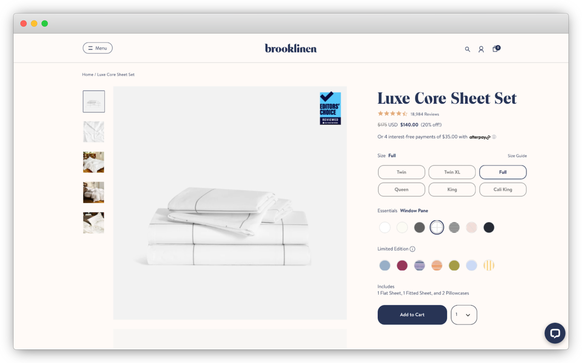
A great PDP example from the Brooklinen website.
The product detail page (PDP) provides pertinent information to the customer to make an informed buying decision. Optimizing the PDP may include simplifying the design, decluttering the page, incorporating white space design, and displaying enough relevant information above the fold when a user first views the page.
A perfect PDP will also contain several essential elements, including the appropriate amount of visuals, personalized pricing and promotions, and customer ratings, to name a few. Companies should use product information management (PIM) software to import, enhance, and organize product information.
Reduce unnecessary clicks
While the 3-click rule for web design has been debunked, it is still important to limit the effort required for a customer to access key information or accomplish a task. Best practices include ensuring that:
- Website navigation is well organized with clear purchase pathways.
- Content gets progressively more specific the deeper into the site structure the user advances.
- Visitors always know where they currently are and how to get to their destination.
In addition, there are many ways to improve the shopping experience and reduce unnecessary steps. Common strategies include providing flexible payment options and organizing your products into logical category buckets with clear names.
Don’t force loyalty unless absolutely necessary
Customers expect speed, convenience, consistency, friendliness, and a human touch when purchasing products online. Forcing loyalty by disrupting the purchase path creates unnecessary friction and causes cart abandonment during the checkout process.
A 2021 Baymard Institute study found that 24% of shoppers abandon orders because websites force them to create accounts. Offering a guest checkout option is a great way to improve the UX for the consumer.
Search result organization
Gartner explains that product discovery is a critical part of a digital commerce funnel and can be seen as low-hanging fruit when considering value-for-money innovation with a potentially high impact on conversion. E-commerce best practices combine commerce search with personalized product recommendations, semantic search using natural language processing, and AI-powered relevance.
Modernize your homepage
Because a company’s homepage is often the first point of contact with a customer, businesses should follow e-commerce design best practices to boost user engagement.
For example, color management, typography, visuals, branding, written content, and information architecture should receive special attention. Cards and carousels can be used to condense information but should be used sparingly (if at all) because of usability issues. Also, adding interactive features such as scroll animations, horizontal scroll, animated text, GIFs, videos, and interactive images and content can enhance the browsing experience.
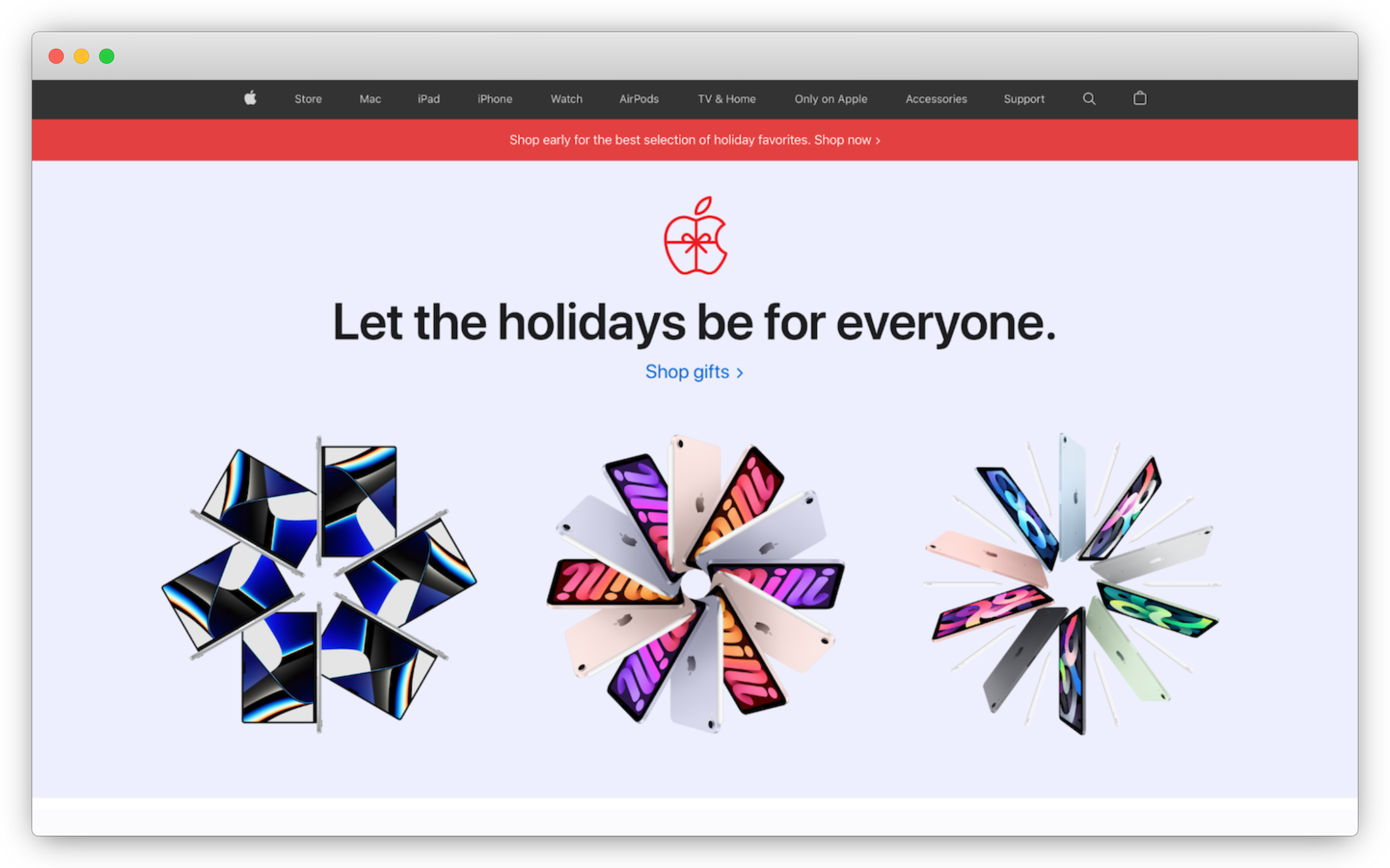
Check out some of the modern features found on Apple’s homepage.
E-commerce homepage best practices should also include quick load times, a mobile-first design, product promotions, simplified search and navigation, personalized product recommendations based on browsing or purchase history, social proof with reviews and testimonials, social media engagement, and community involvement. Including these elements can modernize the homepage and improve the overall shopping UX.
A headless and modular storefront software solution and site builder can build out homepages, category pages, and PDPs.
Optimize the number of items and reduce the complexity of navigation
The navigation menu is an organized list of links to other web pages that allow visitors to access the most useful pages quickly.
A common misconception about information architecture (IA) is that menu items should be limited to around 7. This follows research by George A. Miller, who found that the short-term memory of most people holds about seven items, plus or minus two. However, users don’t memorize navigation menus. Instead, websites can base the number of options on:
- The products sold.
- How products are named.
- Whether users are browsing or seeking products.
- How popular items or categories are.
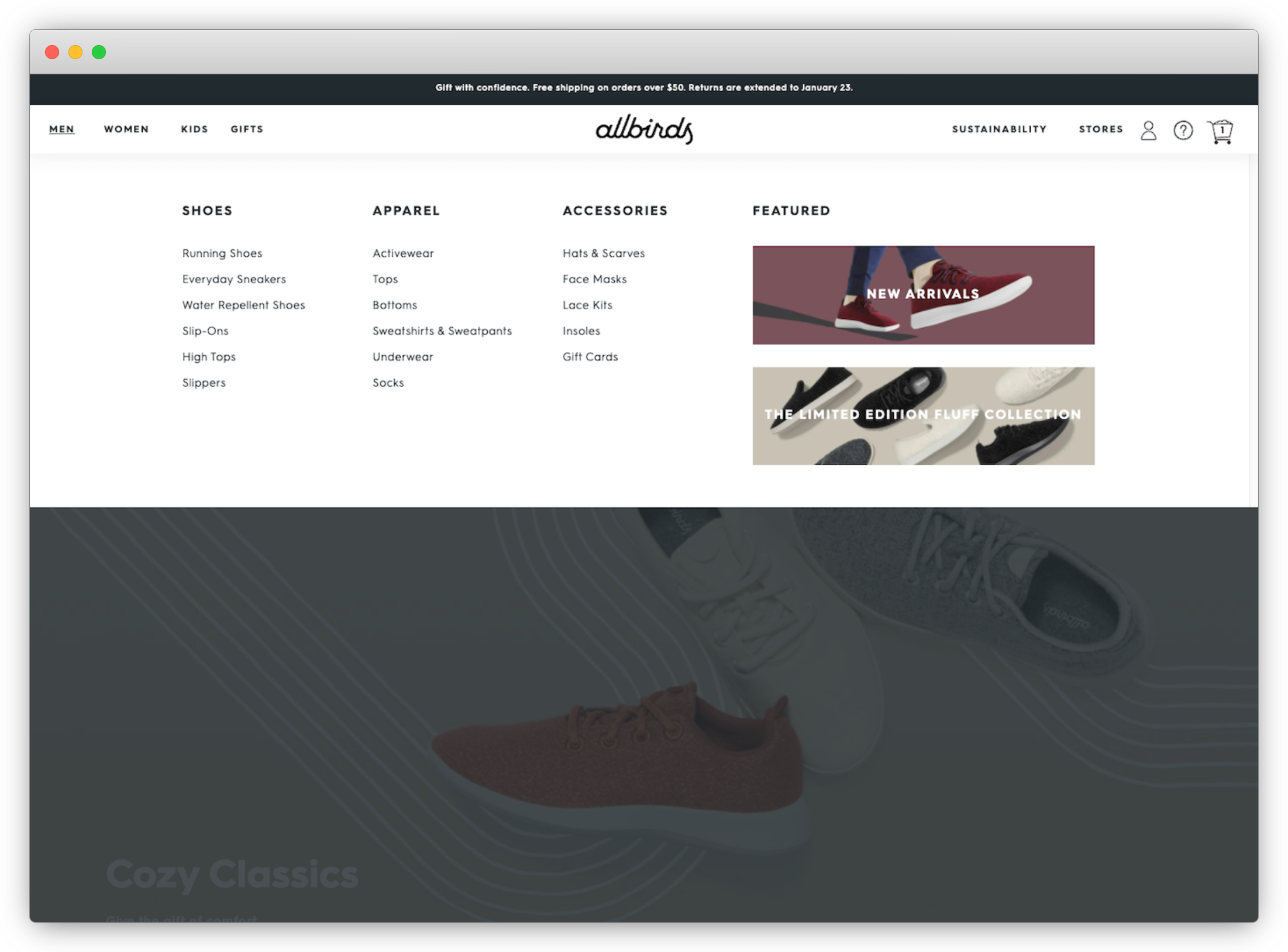
For example, a big-box retailer may surface many more categories and products than a simple t-shirt business. Allbirds does a great job of simplifying the navigation of the site while also showcasing its core values:
Surface loyalty programs
Another e-commerce design best practice is to emphasize your loyalty program throughout the website. Loyalty programs can drive purchases and sales by building relationships with customers. Best practices include promoting loyalty benefits and adding options to sign up to the program in several locations, including the homepage, product pages, and during checkout.
However, it’s important to note that a one-size-fits-all approach does not work. Instead, brands must create a unique loyalty program offering to provide real value to their customers. Using a loyalty management system (LMS) is a great software solution for collecting, accessing, and managing customer data.
Simplify the checkout process
It is common for shoppers to abandon the checkout flow if it takes too long or if the process is too complex.
Some strategies to reduce friction and improve the checkout process include improving the time to interact (TTI) and site speed, creating a 1-page checkout (versus a multi-page checkout), making it easier to add coupons and gift cards, offering a guest checkout option, clearly displaying shipping costs and taxes, and offering more payment and deliver/pickup options.
Use interactive features
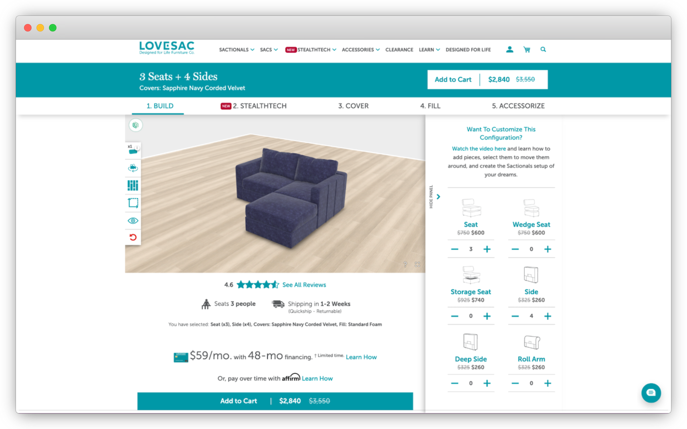
Lovesac provides a really cool interactive experience that allows users to completely customize their sectional sofas.
E-commerce websites can use many interactive features to create a more engaging shopping experience for users.
For example, questionnaires and surveys can lead to more personalized product recommendations, live chat can help with customer support and sales, and 3D images and augmented reality for products can give users more useful product information.
Add company values into the experience
Incorporating company values messaging is another e-commerce website best practice. According to a study by 5W Public Relations, 71% of consumers prefer buying from brands that align with their values.
However, it is not enough for companies to simply create a core values page. Company values messaging should be seamlessly incorporated throughout the website’s design, branding, UX, and navigation.
[toc-embed headline=”More Tips For Building A Great E-Commerce Experience”]
More Tips For Building A Great E-Commerce Experience
We’ve also compiled a shortlist of additional tips that can be combined with the best practices mentioned above to create better online shopping experiences for customers. These include:
- Building and optimizing a social media sales funnel to drive conversions: An ODM Group study found that 74% of consumers rely on social networks to help with their purchasing decisions.
- Incorporating reviews and user-generated content (UGC): Research has shown that 72% of consumers will take action only after reading a positive review, and 85% of consumers say they find UGC more influential than brand-created content
- Incorporating smart assistants or chatbots: Gartner believes that by 2022, 70% of white-collar workers will interact with conversational platforms daily.
[toc-embed headline=”Key Takeaways”]
Key Takeaways
- Adopting e-commerce best practices has become increasingly important for businesses to meet the rapidly evolving expectations of consumers.
- Companies must use a web analytics platform to track various key metrics to gain a clear understanding of how a website performs. Google Analytics remains the most popular platform used today.
- There are many e-commerce best practices to follow, some of which focus on improving the design, branding, service level, technology platform, and website user experience.

Digital services @ fabric. Previously product manager @ Deloitte.
